General dashboard design principles
A good dashboard gives the user an immediate view of the "health" of their organization's data and processes in relation to their role and tasks in hand. The user should be able to quickly identify what needs attention and to easily access any related information. Each user should be able to manage their own dashboard, deciding what to display and where.
Design principles for effective dashboard UX design should be born in mind when designing for the FOLIO Dashboard app:
- Information should be concise and easy to scan, at a glance, with minimum interaction needed. E.g. scrolling should be minimized.
- Content should be timely and up to date.
- Where changes over time or since the last access are important they should be highlighted.
- Comparison of data/information should be possible and under the user's control. E.g. through side by side repositioning of widgets.
- Space is at a premium on the dashboard. The display should be keep concise and clean. Irrelevant content such as unessential graphics should be omitted.
- Common behavioral patterns and presentation styles should be applied throughout to ensure a consistent user experience.
Dashboard canvas
The dashboard is comprised of a canvas and a set of widgets. New widgets are added to the canvas using the "New" option on the Actions menu. The menu also offers the option "Edit widget display order" for controlling the order in which widgets are displayed on the canvas.
Any new options added to the Actions menu should follow the UX design guidelines for:
Widget presentation and behavior
Widgets are cards containing information from FOLIO apps, which are added and managed by the individual user. The below example shows a widget called "Meine Konsortialteilnahmen (aktiv)" (my consortium participation (active))

The aim is to offer widgets displaying data from a variety of apps developed by different teams, but which apply a common set of design principles and patterns to help achieve a consistent user experience. Almost all of the presentation and behavioral aspects are baked into the widget type and will be automatically applied.
When designing for widgets FOLIO design conventions should be applied where appropriate, as documented in the UX guide "MOTIF".
The bare essential UI elements for all widgets are:
- A name summarizing the widget's purpose
- A body containing the key messages and data
- Options to “Edit” and to “Delete” the widget
- A timestamp showing when the content was last fetched
- An option to refresh the content
Widget card
The widget card is a rectangular container with style attributes. The presentation and behavior of the cards is common to all widgets. Style attributes such as alignment and margins, the positioning of elements, and interactive features are core and cannot be not altered.
Card width
Up to four cards will display on a single row, depending on screen width. Cards have a minimum width of 300px and will expand to fill the available column width. Card width is not responsive to content. If content does not fit within the available width a horizontal scrollbar will be introduced. Horizontal scrolling is not desirable from a usability and accessibility perspective and should be born in mind when designing a new widget definition. Where possible, content should resize to fit in the card and the user should be given the option to minimize or completely avoid horizontal scrolling when creating a widget instance. Taking a Simple Search widget instance as an example, the user is able to control which columns which are displayed in a table, and although this means that it is possible for the user to specify many columns (leading to horizontal scrolling), this is entirely under the user's control.
Card Height
The card height is fully responsive to content. No maximum or minimum heights are applied. This should be born in mind when designing a new widget definition. The user should be able to control the amount of content which is displayed. As as example, the number of rows displayed in a Simple Search widget is configurable, meaning that the user has control over how much information is displayed vertically in the dashboard widget.
Widget content
The widget content area is formed of three (conceptual) sections.
- Header
- Body
- Footer
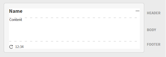
Header
As a minimum the header will contain a name and the "Actions" menu.
The widget Name is a H3 medium headline, left aligned. When the name is too long to fit on one line it will wrap onto the line(s) below.
The Actions menu is accessed via the ellipsis icon. As a minimum it will contain two options: "Edit" and "Delete".
The Edit option will open the edit pane for the widget, a form which the user can complete to define and manage the content displayed in the widget body.
When the user selects to Delete a widget a modal is displayed asking for confirmation, with the option to cancel. A callout message will be displayed to confirm permanent removal of the widget. Delete completely deletes the widget instance.
Body
The main content of the widget is presented in the body. The information displayed in the body will depend on the widget type, widget definition and widget instance. Some widgets may support configuration options which control exactly what is displayed in the widget, while other widgets could be hard-coded to support only specific content. For example, with the simple search widget, the widget definition states which columns are available to display, while the widget instance is used to control which columns are actually displayed in the particular instance - so for simple search the user is able to control what columns display in the widget instance via the Widget Edit option.
Footer
The footer will contain, as a minimum, a "refresh" icon and a timestamp showing the time of the last load of the widget. If the widget has a link button to another app or external web page it will be displayed in the corner opposite the timestamp.
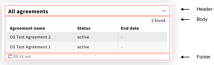
Widget content example
The Simple Search Widget offers an example of how a widget can be used to display lists in a tabular layout using the widget header, body and footer. The body is the section of the widget that is available for the display of the data.
Widget position
A widget’s position on the dashboard canvas changes in response to browser width. On a wide screen up to four columns of widgets may be displayed. As the available width narrows the number of columns reduces, applying standard FOLIO break points, to fall into a single columnar view on narrow screens.
The user can manually change the order in which the widgets display via the the "Edit widget display order" option on the Actions menu.
Messages and feedback to users
Where messages relating feedback about system operation are displayed to users the appropriate UX guidelines should be applied.
Error messages
Error messages should be displayed in a banner and apply the appropriate guidelines for language.
When the error relates to the general dashboard the message should display at the top of the canvas.
Errors relating to a widget should display in the widget body.
Unable to find the dashboard canvas
When there is a problem retrieving a dashboard a message will be displayed on the canvas: "Dashboard (name) cannot be found. Please check the URL."
Unable to display any widget content
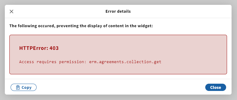
If a widget's content cannot be displayed, for example the user does not have the correct permissions, an error message should be displayed in the widget. As there are many reasons for this possible failure a general error message will be displayed together with a link to the full error log.
The error message will be displayed in the widget body using the Error "Message Banner" component. The message will be formed of two parts. The text to be displayed is "Content cannot be displayed". The second part is a link to "View error details", as shown in the example below.

The "View error details" link UX pattern should mirror that of the Error Boundary component. Selecting the link will open a new modal.
- The modal header is "Error details".
- The first paragraph of text introduces the error with the text "The following occurred," and then a brief description of the result of the error. For example "The following occurred, preventing the display of content in the widget:"
- The error details are presented in full
- An error heading is displayed
- An option to "Copy" the error to the clipboard is presented
An example of the error modal displayed when the user has insufficient permissions to view the content of a widget is shown below.
Unable to display specific content in a widget
When part of the content within a widget cannot be displayed, for example the content of an MCL cell, an error should be displayed in situ. The error message should be kept brief so as not to take up too much space, with a link to the full error details.
The error message will use the Error "Message Banner" component. The text should summarize the error, for example "Data Error". The example below shows an example of a data error within table cells.
The "View error details" link UX pattern should mirror that of the Error Boundary component. Selecting the link will open a new modal.
- The modal header is "Error details".
- The first paragraph of text introduces the error with the text "The following occurred," and then a brief description of the result of the error. For example "The following occurred, preventing the display of content in the widget:"
- The error details are presented in full
- An error heading is displayed
- An option to "Copy" the error to the clipboard is presented
Informative messages and confirmations
Informative messages to users may be displayed in situ, in toasts/callouts or in modals. Messages confirming successful actions such as "Save" should follow the standard FOLIO patterns. Guidelines for informative message language and confirmation message language should be applied to the text of messages.
Widget body has no content
If no content is retrieved for a widget a message will be displayed. The text displayed will be defined in the Widget Type. For example, the Simple Search widget type message is: "No (record type)s found" and this will render "No agreement found" for the "ERM Agreements" widget definition.
Validation
The FOLIO guidelines for validation messages should be applied:
Accessibility
The dashboard app has been built with accessibility in mind. All further design and development should adhere to the FOLIO guidelines for accessibility. Some particular accessibility checks to bear in mind when designing for the dashboard are:
- All features of the canvas and its widgets should be usable via keyboard-only.
- When using drag and drop to reorder UI elements, ensure that the tab order changes accordingly.
- Ensure repeated UI components such as buttons and menu options can be uniquely identified by a screen reader. For example the Simple Search widget definition will auto-generate aria labels for:
- each widget's "Actions" menu as "Change order of
widget name" - Edit and Delete options in each widget as "Edit
widget name" and "Deletewidget name" - Refresh icons as "Refresh widget
widget name" drag handles on the widget reorder pane as "Change order of
widget name"
- each widget's "Actions" menu as "Change order of
Internationalization
The user interface has been designed to work with right to left languages.